|
Overview of the Design Window
The Design Window is where the user interface for client applications
is created. Graphical containers and components are added and arranged
in a layout grid and their contents, attributes and event linkages are
assigned. The Design Window is made up of several parts: a Menubar,
Toolbars,
Component
Tree Panel,
Design Layout Panel, Properties
Panel, and a Status Panel. Each of these is discussed
more fully below.
Menubar
File
File-->NewEdit Contains menu choices for cut, copy and paste actions. Edit-->CutView Contains menu choices for viewing other windows and for changing Jargon Writer's "Look and Feel". View-->Script EditorRun Renders (paints) the currently active app, executes it in an emulator, or generates host source code for the remote procedure calls defined in the app's script. Run-->ExecuteHelp Displays various online documentation and other reference information. Help-->Help TopicsToolbars The toolbar panel contains two toolbars with buttons that perform different types of actions. The first toolbar contains six buttons that perform file-related actions, as discussed in "Working with XML Procedures" in Section 1. The second toolbar contains a set of component toolbars that are used to select component types when you are creating a screen layout in the Design Layout Panel.
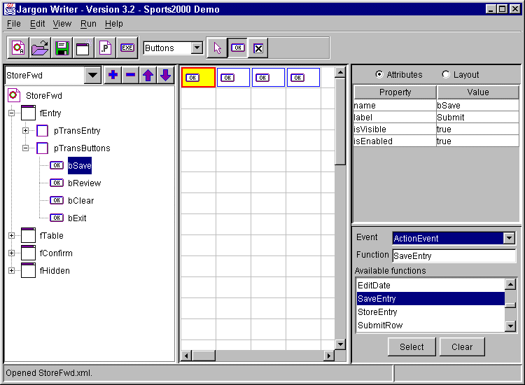
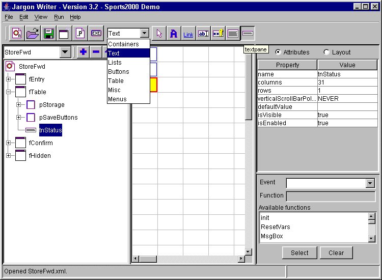
The first toolbar has six buttons which perform file-related actions that are the same as their corresponding menubar choices. The first button ("Create new application object") is the same as the "File-->New" menu choice.Component Toolbars The second toolbar contains seven separate toolbars, each with one or more related components, that are used when adding visual objects (containers and components) to the Design Layout Panel or when adding nonvisual objects to the Component Tree Panel. The toolbar with the desired group of components is selected from the drop-down combo box to the left of these toolbars. Unlike the first set of buttons, these visual object selector buttons stay depressed once clicked, until a different button within this group is clicked. Whichever button is depressed represents the type of object that will be added when you click on a grid cell within the Design Layout Panel or click the "+" button in the Component Tree Panel. 1. Containers Toolbar The "Frame" button selects a frame container object. Frames can only be added under the app "root" node. An app can contain any number of frames. Each frame can contain any of the following objects: menubar, toolbar, panel, cardpanel, tabpanel, label, textfield, passwordfield, textarea, textpane, combobox, listbox, button, togglebutton, checkbox, radiobutton, buttonGroupPanel, table, tree, internal frame container, and progressbar.2. Text Toolbar The "Label" button selects a label with an image or text caption.3. Lists Toolbar The "Combobox" button selects an object similar to a text field, but with an arrow at the right that, when clicked, "drops down" a scrollable list of choices. Combo box selections can be populated with static initial values that are assigned by adding ListItem components to the Combobox, or with dynamically assigned values supplied by a host or client function.4. Buttons Toolbar The "Button" button selects a rectangular button that can contain an image, a caption, or both.5. Table Toolbar The "Table" button selects a spreadsheet-like Table (or "Grid" for Oracle folks) with multiple rows and columns, which can be used for displaying browse results and row selection. Tables can have both horizontal and vertical scrolling, column headings, single row selection and other features. To add columns to a table, highlight the table in the component tree, then select the "TextCellEditor" or HyperlinkCellEditor button and click the "+" button above the component tree.6. Misc Toolbar The "Image" button selects an image component that can be used to display GIF or JPG images on Windows-based devices. Only GIF87a images can be displayed on PalmOS-based devices in Version 3.2.7. Menus Toolbar The "Menubar" button selects a menubar component that can be used to contain menu choices. The left-hand panel in the center of the Design Window is the Component Tree Panel. This panel is used to select the currently active "app", and to select a specific component object within the app so that you can modify its layout, properties, events and attributes in the two panels to the right of the Component Tree Panel. At the top of this panel is a combo box which shows the currently active app, or a blank entry if no app has been opened or created yet within this session. This combo box is also used to select a different app as the currently active app. You can select any app that has previously been opened or created in this session, and not yet closed, which makes it very easy to work on multiple related apps in one session. The currently active app is the one whose tree structure, layout, properties and functions will be displayed in the corresponding panels and windows. To modify an app, it must be opened and currently active. Below the combo box is a tree representation of the visual objects that make up the app, starting with the "root" object which is the app itself. To expand the root object, double-click on it. Unlike all other tree nodes, the root object does not have a "+/-" sign that can be single-clicked to expand or contract the node. When you expand the root icon, you will see one or more frames and/or miscellaneous containers that are the first level containers within the app. By clicking on the "+" sign in front of a frame, or by double-clicking on the frame icon or name, you can see the next level of contents within the frame, such as panels, menubars and other objects. This process may be continued recursively within a branch of the tree, until it is fully expanded (all branches are fully opened down to each individual "leaf"). Each type of container object and component object has its own icon. Frames and non-visual containers are shown in the order they were defined. Most other types of objects are displayed in the same order as their layout in the Design Layout Panel, reading from left to right and top to bottom. Objects that are defined in list boxes in the Properties Tabpanel rather than in the Design Layout Panel (such as tabs in a tab panel) are displayed in the same order as in the list box. To select an object to work on, single-click it within this tree. If it is a container which is not expanded, you can double-click the icon or name, which will both select the object and expand its first-level tree contents. When a frame or panel is selected, its first-level contents are displayed in the Design Layout Panel (the center panel), and the Properties Tabpanel (the right-hand panel) shows the various properties of the frame or panel selected. When a tabpanel or card panel is selected, the center panel will be blank, and the panels that make up the tabpanel or card panel will be shown only in the component tree. This is because the panels contained in a tabpanel or card panel are not laid out in a grid pattern, but rather are all overlaid or "stacked" on top of each other, so a grid layout is not appropriate. (Note: these components are not available in Version 3.2). Table cell editors, misc. containers, message handlers, button groups, trees, tree nodes, menubars, submenus and menu items also do not display anything in the center panel, only in the component tree. (Note: some of these components are not available in Version 3.2). When you select other components such as buttons, checkboxes, labels, textfields, textareas, combo boxes and list boxes, the selected component will be displayed in the center panel along with all other "sibling" components that have the same parent container, and the selected component will be highlighted in blue. Also, the righthand tabpanel will display the properties and attributes of the selected component. To Add certain "child" components to a "parent" component, such as a listitem to a combobox, or a textcelleditor or hyperlinkcelleditor to a table:
To Delete a component, click on its node in the component tree, then click the "-" button at the top of the component tree panel. When this button is selected, a confirmation message box is displayed. Be very careful when deleting to be sure you are deleting the object you intended. It is also a good idea to do a "save" immediately before deleting one or more items. To Rearrange the order of two or more components, click on a component node in the component tree, then click the up or down arrow button at the top of the component tree panel to move that component up or down within its container. This is primarily used for components like menu items, listbox choices etc. that do not have a gridbag layout representation. Design Layout Panel
When starting a new app, you begin by clicking the "New" toolbar button or selecting "File-->New" from the menubar. When this is done, you will see one frame (with a default name such as "Frame0") appear in the Component Tree Panel. If you click on this frame node in the component tree, you will see a checkerboard-type grid pattern in this Design Layout Panel. To begin adding containers and components to this frame, first click (depress) the toolbar button for the type of container you want (such as a panel) from the appropriate toolbar group (such as Containers), then click in the upper leftmost cell of the Design Layout Panel grid. A panel will be added within the frame, and the tree node for Frame0 will be expanded so you can see the Panel0 node, which is highlighted. Notice that the grid layout is cleared; this is because you are now viewing the contents of Panel0, and can begin adding components to it. To practice, click the "Label" toolbar button, then click in the upper leftmost grid cell to add a label, then click the "Textfield" toolbar button and click in the grid cell to the right of the label cell. Congratulations, you have just created your first screen layout in Jargon Writer! To view your screen as it will appear, highlight the root object in the component tree, then click the "Execute" toolbar button. You will see that a very small frame has been created, just large enough to hold the label and textfield and the panel. This is the default layout behavior for the Java-based layout system used in Jargon Software products: the "GridBag Layout Manager". Components are placed right next to each other, and containers shrink to the smallest size that can hold all of their contents. This default layout can be changed by selecting various layout attributes (or "constraints") in the Layout Panel within the Properties Panel. For a more detailed explanation of the layout system (called the "GridBag Layout Manager") used in this panel, refer to the GridBag Layout Manager document. You can close the execution window by clicking the "X" button in the upper right-hand corner. To save the appfile you have just created, click the "Save" toolbar button or select "File-->Save" from the menubar, then assign a name such as "myapp.xml" and click Save. Notice that the appnames in the combo box and root node of the Component Tree change to "myapp". Notice that you can select a component in a container by either clicking on its node in the Component Tree or by clicking on its cell icon in the Design Layout Panel. To move an object from one grid cell to another, drag it with the left mouse button depressed until the upper left-hand corner of the object is inside the destination cell, then release the mouse button. You don't have to position it exactly over the grid cell, if the upper lefthand corner is inside the cell, it will "snap to" when released. To make an object taller or wider relative to the other sibling objects in the same container, position the mouse cursor over an edge of the object until it changes to a horizontal or vertical two-headed arrow, then drag the edge until it is inside the cell you want to exand it into. It will "snap to" the outer edger of that cell; you do not need to get the edge of the object positioned over the edge of the destination cell.
This panel on the right side of the Design Window contains three panels: an Attributes Panel, a Layout Panel, and an Events Panel. The Events Panel is always displayed at the bottom, while the other two panels can be viewed by selecting either the Attributes or Layout radio buttons at the top of this Properties Panel.
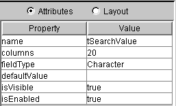
The Attributes panel contains a wide range of properties specific to the type of object to which they apply. For example, the properties of textfields include initial value, column width, field type, and default value options. The meanings of most of these various object properties are self-explanatory. For a detailed explanation of each property of each object type, refer to the Component Properties section. The only property that is common to every container and component is the object name, which must be unique for every object (container or component) within an app. IMPORTANT: All object names in Jargon Software apps are case-sensitive, which means that "Frame0" and "frame0" are the names of two different frame objects and cannot be used interchangeably. This is the opposite of some other languages (like the Progress 4GL) which are case-insensitive (where the compiler does not care how upper and lower case letters are used for variable names, procedure names, or table and field names). Similarly, the Unix operating system IS case-sensitive, while DOS and Windows are not. For this reason, it is important to adopt a consistent set of rules for naming objects within your app, and these rules should also specify upper or lower case.Some other common properties used in many components are listed below.
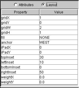
The Layout Panel contains the various GridBag constraints which control
the placement and resizing behavior of an object. For more details on each
of these constraints, refer to the GridBag Layout
Manager document.
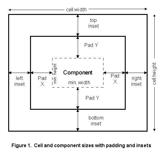
The GridX, GridY, GridW and GridH values are read-only. These values are determined by the placement of an object in the Design Layout Panel (its X/Y coordinates) and by how many cells it occupies (its height/width).The following diagram (Figure 1) may help to explain the various GridBag constraint parameters.
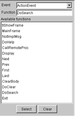
The Events Panel is used to identify which events Jargon Reader will respond to on a specific object, and which function will be executed when those events occur. For a more detailed discussion of events and functions, see the Overview of Functions, Methods and Events section. The Event name combobox lists all of the events that Jargon Reader can "listen for" on an object. The events in the list vary depending on the type of object. Some objects have no events. To see or change the function associated with a given event, select that event in the Event Name combobox. To associate an Event with a function, first select the event in the combobox, then click the desired function name in the Available functions listbox (scrolling if necessary), then click the "Select" button in the bottom set of buttons. This will add the specified function to the Function to execute field (below the Event name combobox). To unassociate (remove) a function from an event, first select the event in the combobox, then click the "Clear" button in the bottom set of buttons. To add, change or delete the functions which are shown in the Available Functions box, select View-->Script Editor from the top menubar to bring up the Script Editor Window. Or, simply double-click any function name in the listbox to open the Script Editor and position it to the selected function within the text editor window. Borders Editor
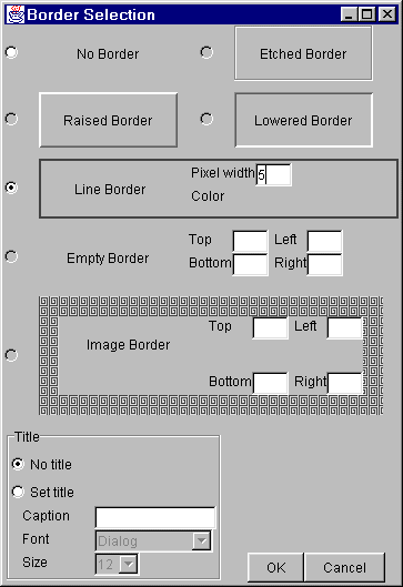
The Borders Editor window is used to add a visible border to a container object, typically a panel. To access this window, click in the "Border" property value field for a panel or other container which can have a border property, then click the button at the right of the value field to open the above window. The border type is selected by clicking the radio button in front of each border choice in the Borders Editor window. Available choices are the following (some choices may not be currently available and will be grayed out): No Border (the default) The etched, raised, lowered and line borders also allow an optional title to be entered, by checking the "Set Title" radio button in the Title panel of this window, then entering the title caption, font face and font size. The title will be displayed on the top edge of the border, starting near the left side. After making border selections, click the "OK" button in the Border Editor window. If you do not want to use your selections, click the "Cancel" button. The Status Panel at the bottom of the Design Window contains a one-line message area at the lower left in which various Jargon Writer status messsages are displayed, and a progress bar at the lower right which graphically indicates the completion status of various actions such as opening, closing and executing apps. No input fields are used in the Status Panel. Error Console
|
 User Tip: The first button in each of the component group toolbars is an
upward-pointing arrow, similar to the image used as a mouse cursor. This
is a "do-nothing" button that simply shuts off selection of the other buttons
in that toolbar. It is useful to click this when you are done adding a
certain type of component, in order to avoid adding more instances of that
component by accidentally clicking in an empty grid cell in the middle
layout panel.
User Tip: The first button in each of the component group toolbars is an
upward-pointing arrow, similar to the image used as a mouse cursor. This
is a "do-nothing" button that simply shuts off selection of the other buttons
in that toolbar. It is useful to click this when you are done adding a
certain type of component, in order to avoid adding more instances of that
component by accidentally clicking in an empty grid cell in the middle
layout panel.